

Is your website showing signs of redesigning – slow loading speed, broken links that degrade user experience, poor mobile experience, etc.? A typical website redesign would cost you $3,000 – $75,000. Now, if that kind of investment feels practical at the moment, here’s some good news.
Most websites do not require a complete redesign, but rather smarter improvements.
Often, performance and design issues come from small gaps–cluttered layouts, weak design hierarchy, unreadable text, or poorly placed call-to-actions. Fixing these doesn’t require rebuilding your site from scratch. There is no need to rebuild your site to fix these. By making specific changes, you can easily clean up your pages, speed them up, and get them more conversion-friendly without losing your current structure and rankings.
Let’s dig deeper into it.
What Does “Improving Design” Really Mean?
Here’s an interesting truth: Design ≠ just visual beauty. A majority of businesses believe that the only way to enhance the design of their websites is to change colors, typography, or layouts. However, that is not the whole story.
Website design is not about making it prettier, but making the underlying components that define the way users use the site better.
Having an attractive site with a beautiful background and buttons is pointless when it takes several years to load or is not user-friendly.
Other aspects of good design, including navigation, usability, clarity, speed, trust signals, mobile experience, etc., are also important, as they determine how visitors stay, comprehend your message, and act.
When you ignore these ‘functional elements,’ even the most attractive interface fails to hold visitors for long. They feel confused, frustrated, or uncertain, making them leave and never return (most of the time).
On the other hand, strong design quietly guides visitors through your content, answers their questions, and removes friction at every step. It helps them find what they need faster and builds confidence in your brand.
Therefore, improving design should also focus on how the site performs and communicates, not just how it appears at first glance.
8 Practical, Fast Design Improvements To Focus On
Below are some small tweaks that can improve your site design, functionality, and the impact it creates.
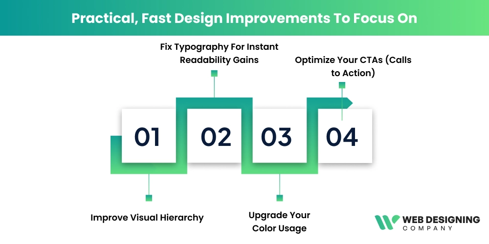
1. Improve Visual Hierarchy
Let’s first understand what “Visual hierarchy” means!
It is the way design elements on a page are arranged and styled to show visitors what to look at first, second, and next.
Visual hierarchy uses size, contrast, color, spacing, and placement to guide attention and make content easier to scan and understand; it helps them find the information they need easily on your site.
When visual hierarchy is weak, your visitors struggle to hunt for what’s important—a headline that blends in naturally, a key benefit that goes unnoticed, or your primary CTA gets lost in the noise.
The result?
This inconvenience and confusion lead to higher bounce rates and lower conversions, even if your site looks pretty.
Increasing the clarity of your hierarchy doesn’t require a redesign; it just requires strategic changes to existing elements. Here’s what you can do:
- Increase headline size and weight so your main message stands out instantly on each page.
- Create a clear heading hierarchy (H1 -> H2 -> H3) to make scanning easier.
- Make your primary CTA visually dominant compared to secondary buttons.
- Use contrast more intentionally between primary content and supporting text.
- Reduce visual competition by toning down less-important elements.
- Add spacing between sections to separate content blocks clearly.
- Group related items together to create visual section that users can process faster
- Align text and elements consistently to reduce visual noise.
- Place key messages higher on the page where attention is the strongest.
These low-effort design refinements make your content easier to scan and interact with, and they can improve page performance and conversions without touching the overall layout or structure of your website.
2. Fix Typography For Instant Readability Gains
Typography fixes are one of the fastest ways to improve your website design without touching the layout. Many sites lose readability simply because the body text is too small.
For most modern websites, body text should typically be equivalent to 16-18px. If users are required to zoom in to read comfortably, your typography is hurting engagement.
Other elements to improve are line height and paragraph spacing. Dense text blocks feel intimidating and reduce comprehension. A line height of around 1.5-1.7 x the font size usually improves reading flow. Add consistent spacing between paragraphs so content feels breathable and scannable rather than cramped.
Do not use more than two typefaces at most, usually one for headings and one for body text, with an optional accent font. Too many fonts create visual noise and weaken brand consistency.
Some other typography tweaks include:
- Verify typography on mobile devices.
- Set contrast, ensuring your text stands out clearly against the background.
- Avoid light-gray text on white or color-on-color combinations as they reduce legibility.
- Use a distinctive, strong heading font with a simple, highly readable body font for safe font pairing. This creates hierarchy while keeping readiness effortless.
3. Upgrade Your Color Usage
Improving color usage doesn’t mean changing your brand’s palette. It’s about using colors more strategically to guide attention and boost clarity. Thoughtful contrast between text, backgrounds, and key elements like buttons makes content easier to read and interact with.
For example, using a high-contrast button color against a neutral background can significantly improve visibility, and contrasting hues have been shown to boost CTA click-through rates by up to 21% in some tests.
Keep your main palette limited to a few core colors, and reserve accent colors for call to action or important links to avoid overwhelming users.
Good use of white or neutral space around colored elements further enhances focus and visual hierarchy. Avoid overusing bright accent shades; instead, let color support clarity and intent.
4. Optimize Your CTAs (Calls to Action)
CTAs are an effective way to guide visitors toward taking action. Here’s how you can make them even more effective.
- To make your CTAs stand out, use colors that contrast with the page. Using an orange colored button, for example, on a blue page is more eye-catching than a gray button.
- CTAs with descriptive phrases—clear and action-oriented language like “start your free trial”, “get your free quote” are far more effective than vague CTAs like “Click Here”.
- CTA placement should be carefully done. Place them where users actually need/expect them, like on top of the page, at the end of a blog post, or after an important section.
In short, mobile design is not optional. It’s a basic requirement.
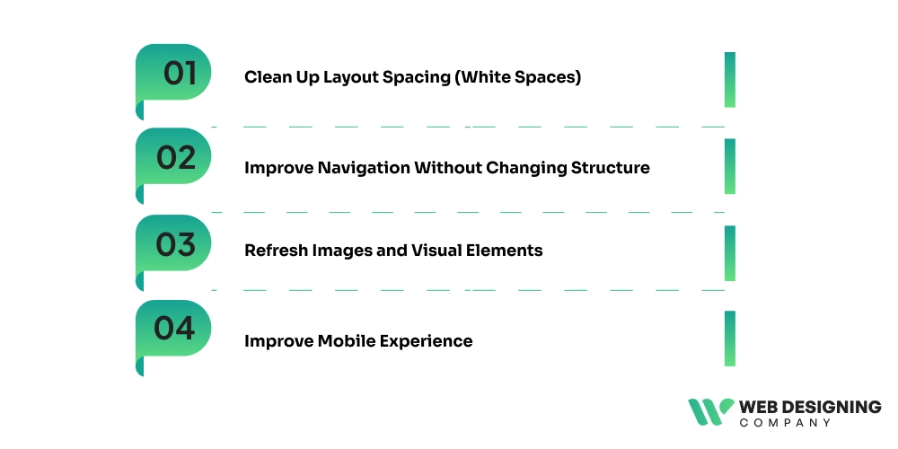
5. Clean Up Layout Spacing (White Spaces)
This is one of the simplest ways to make your site feel modern and professional without redesigning it.
When elements sit too close together, users feel overwhelmed, making scanning difficult for them. To avoid this, add consistent padding around text blocks, images, and buttons to create breathing room.
Increase the space between sections so each topic feels clearly separated. Also, use whitespaces to highlight important elements like headlines and call-to-action rather than filling every area with content. Studies show that users read up to 20% more content on pages with proper whitespaces. That’s because it reduces cognitive load and improves focus.
6. Improve Navigation Without Changing Structure
Wondering how this can be achieved? Well, by simplifying how the choices are presented.
- Start by rewriting menu labels in plain, user-focused language.
Clarity beats clever wording.
- Remove low-value or rarely-clicked menu items to reduce decision fatigue.
- Add a sticky header to make navigation visible as users scroll.
- Make your contact or primary action link clearly accessible at all times.
- For content-heavy sites, include a search bar to speed recovery.
- Finally, reduce dropdown overload; too many nested options slow down and increase confusion.
7. Refresh Images and Visual Elements
Outdated stock photos, inconsistent illustration styles, or low-quality graphics quietly damage credibility and make pages feel stale. Hence, replace generic visuals with high-quality, relevant images that support your message and reflect your brand tone.
Whenever possible, use real product, team, or process photos to build authenticity and trust.
Add simple icons or section dividers to improve visual flow and scannability. Keep styles consistent across pages so the site feels cohesive. Also, compress and properly size images to maintain fast loading speeds while still delivering sharp, professional visuals.
8. Improve Mobile Experience
Start by checking text size and button tap areas on real devices, not just desktop previews. Mobile users should be able to read content without zooming and tap buttons without precision. Simplify stacked sections so the most important content appears first on smaller screens. Reduce intrusive pop-ups and large banners that block content, as they frustrate users and increase bounce rates.
Also, review spacing — cramped mobile layouts feel harder to navigate. With mobile traffic often exceeding 60% of total web visits, even small mobile usability improvements can produce meaningful gains in engagement and conversions.
Quick 30-Minute Website Improvement Checklist
| Area | Quick Action | What to Check | Expected Impact |
|---|---|---|---|
| Typography | Increase body text size | Ensure body text is at least 16–18px | Better readability and lower bounce rates |
| Contrast | Improve button & text contrast | Make sure CTAs stand out from the background | Higher click visibility |
| CTAs | Rewrite main CTA text | Use benefit-driven wording | More conversions |
| Spacing | Add section padding | Increase space between content blocks | Cleaner visual flow |
| Headings | Strengthen visual hierarchy | Maintain clear H1–H3 size differences | Faster content scanning |
| Navigation | Simplify menu labels | Use plain, user-focused words | Easier navigation experience |
| Images | Replace weak visuals | Remove outdated stock photos | Higher user trust |
| Mobile | Test top 5 pages on mobile | Check text size, buttons, and spacing | Better mobile UX |
Final Takeaway
Improving your website doesn’t always require a costly, time-intensive redesign. In many cases, small focused upgrades, such as better typography, clearer hierarchy, stronger CTAs, cleaner spacing, and mobile improvements, can dramatically improve usability, trust, and conversions.
These changes work because they reduce friction and help visitors understand and act faster, without disrupting your existing structure or SEO value. Start implementing these changes to your five highest-traffic pages and apply these quick wins first, then iterate based on user behavior and performance data.
And if you want expert help in implementing these improvements efficiently, the team at the Web Designing
Company can guide you. We specialize in practical design enhancements that deliver measurable results without full rebuilds.