

Imagine landing on a website, and it takes too long to load or doesn’t open properly on your device. Do you really think you will wait until it fully loads?
The answer is no.
Most visitors leave instantly, and many of them might end up with your competitors. According to Forbes, an estimated 76% of consumers have abandoned carts because of a non-responsive website.
With so many device options like laptops, tablets, mobiles, desktop, you never know which one your audience will use. Each device has a different screen size, and your website needs to adapt, offering a seamless experience no matter what. With this, the user experience is improving.
And this is just one benefit. There are many more advantages of responsive design that we explore in this blog.
Read the full blog and know how responsive websites are important for your business growth.
What you learn from here:
- What does responsive means
- What Happens When You Ignore Responsive Design
- 8 Powerful Benefits of Responsive Web Design for Business Growth
- Beyond Responsiveness: Factors That Help Your Business Grow
- Questions People Commonly Ask
- Make Your Website Responsive with a Professional Web Design Company
What is a Responsive means?
A responsive website is one that automatically adapts to any screen size your users use. Whether it is opened on a mobile phone, tablet, laptop, or desktop, the website looks clean and works smoothly. As the screen size changes, the layout and content adjust on their own. This makes it easy for users to read, scroll, and interact without effort. In return, businesses reach more users and deliver a better browsing experience.
What Happens When You Ignore Responsive Design
Ignoring responsive design in today’s mobile-first world can cost your business significantly. It can severely damage your online presence and limit growth. Some of the major negative impacts your business may face include:
Drastically lower SEO rankings and possible Google penalties
High bounce rates and loss of potential traffic
Decreased conversions and revenue
Damage to brand credibility
Reduced accessibility for users
Higher long-term maintenance costs
8 Powerful Benefits of Responsive Web Design for Business Growth
Responsive web design is the most effective tool for boosting your business traffic, estimated at up to 40% growth in mobile and improving the conversionrate by 25%- 62%. When your website adapts smoothly to any device, this will gives the better experience to your users.
Let’s explore these benefits and show why responsive design matters so much.
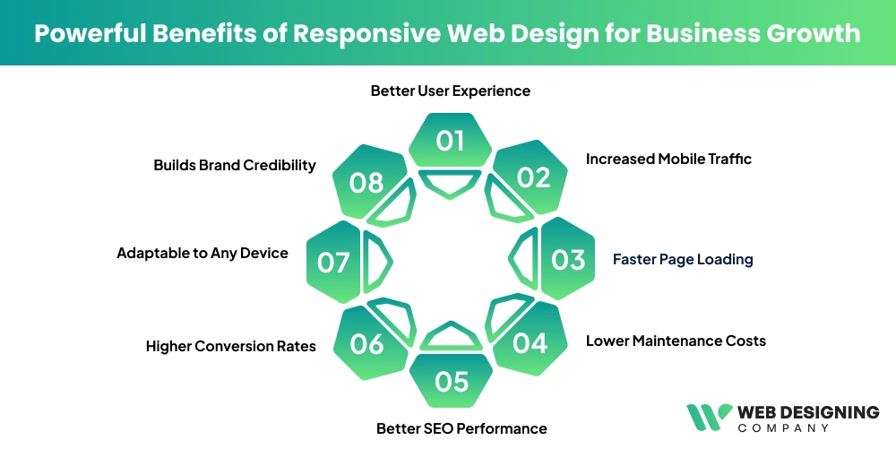
1. Better User Experience
When a website adapts to any screen size, it automatically improves the user experience. Undeniably, user experience is everything in today’s competitive digital world. People visit your site from different devices, and while the screen may change, one expectation remains the same: the website should look visually appealing and work flawlessly.
As the study shows, 74% users spend more to the website when your website is mobile-friendly. When your website is responsive, your website automatically adjusts to the screen size. This means you don’t need to zoom in or out, no sideways scrolling, and, more importantly, zero frustration.
A smooth experience keep sthe visitors on your site longer. It leads users to encourage them to take action, such as making a purchase or contacting the business for information.
2. Increased Mobile Traffic
After mobile phones became easily accessible, digital store sales scaled rapidly. Today, most people browse the internet through their smartphones. There are approximately 5.78 billion unique mobile phone users globally, with smartphone users reaching around 4.88 billion.
In fact, that’s a large portion of your target audience. If your website is not mobile-friendly, you could definitely lose them. A responsive web design ensures your website works perfectly on all mobile devices. It’s essential. This helps attract more visitors and makes it easy for them to navigate and engage with your site.
A website is not a one-time project. It’s an ongoing process.
3. Faster Page Loading
Website speed is crucial for keeping users engaged. If your site takes more than 2 seconds to load, visitors may leave before even seeing your content, increasing your bounce rate and hurting your website’s performance. Responsive websites load quickly on any device.
They automatically adjust images and layouts to fit the screen, cutting down waiting time and frustration. Fast-loading pages keep visitors browsing longer, make it easy for them to explore, and encourage actions like making a purchase or contacting you. Plus, search engines favor faster sites, boosting your ranking.
In short, mobile design is not optional. It’s a basic requirement.
4. Lower Maintenance Costs
Managing a website can get complicated if you have separate versions for desktop and mobile. Responsive web design solves this by letting you run a single website that works perfectly on all devices. Any changes or updates you make only need to be done once, and they automatically reflect everywhere.
This saves you time, effort, and a lot of money. You don’t have to worry about fixing multiple sites or repeating tasks. It makes running your website much simpler and more cost-effective, letting you focus on growing your business instead of constantly maintaining different versions of your site.
5. Better SEO Performance
Search engines like Google prioritize websites that are mobile-friendly and deliver a smooth user experience. In today’s digital world, if your site isn’t easy to use on phones, tablets, or desktops, it can hurt your visibility.
A responsive design automatically adjusts your website to fit any screen, making it easier for visitors to navigate without zooming or scrolling sideways. This not only keeps users engaged but also signals to search engines that your site is reliable and user-friendly. When your website ranks higher in search results, more people can find your business online, which drives traffic, increases leads, and boosts potential sales.
6. Higher Conversion Rates
When your website is easy to use, visitors are more likely to take action, whether it’s signing up for a newsletter, buying a product, or filling out a contact form. Responsive design removes obstacles like small text, broken buttons, or pages that don’t fit the screen. Everything works smoothly, so users can interact with your site without frustration.
A site that’s simple to navigate keeps visitors engaged and encourages them to act. The result is higher conversion rates, more leads, and ultimately better growth for your business, all because your website works the way your users expect it to.
7. Adaptable to Any Device
Technology is constantly evolving, and new devices enter the market regularly. As a result, screen sizes continue to vary. When your website is responsive, it adapts smoothly to any device. Skilled web design experts achieve this using a single, flexible codebase that automatically adjusts the layout, content, and images to fit different screen sizes. This keeps your website modern, functional, and easy to use.
No matter which device a visitor uses, your website looks appealing, works smoothly, and delivers a high-quality experience. Overall, staying adaptable not only keeps users satisfied but also helps your business stay ahead of competitors in an ever-changing digital landscape.
8. Builds Brand Credibility
A professional, responsive website sends a positive message about your business. Seamless performance and easy navigation signal to visitors that you are trustworthy, modern, and attentive to their needs.
It also shows potential customers that you genuinely care about their experience. When users land on your website, they feel confident in your brand, which encourages them to return again and again. In the digital world, first impressions are everything, and a well-designed, responsive website helps you make the right one every time.
Beyond Responsiveness: Factors That Help Your Business Grow
Responsive web design is importatbuthere some other factors that you can focus on that will help your business to rank at the top. This helps to drive more traffic and conversions.
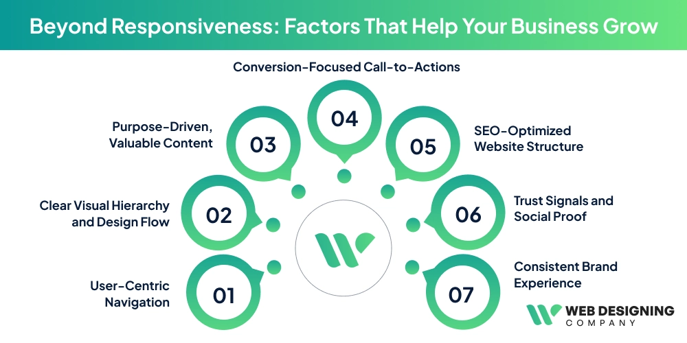
User-Centric Navigation
Simple navigation keeps users comfortable. When people can find what they need without thinking, they move forward with ease instead of dropping off.
Clear Visual Hierarchy and Design Flow
A well-structured layout directs attention naturally. Smart spacing, readable typography, and balanced contrast help users notice what matters most at the right time.
Purpose-Driven, Valuable Content
Content should answer real questions. When visitors feel understood and informed, they stay longer, trust your brand, and return when they’re ready to act.
Conversion-Focused Call-to-Actions
Clear and well-placed CTAs remove hesitation. They tell users exactly what to do next and make the decision feel simple and natural.
SEO-Optimized Website Structure
An SEO-friendly foundation improves visibility. Higher rankings attract steady organic traffic and support long-term, sustainable business growth.
Trust Signals and Social Proof
Testimonials, reviews, certifications, and case studies build confidence. They reduce doubt and reassure users they’re making the right choice.
Consistent Brand Experience
Consistency creates familiarity. When visuals and messaging align across every page, your brand feels reliable, professional, and easy to remember.
Make Your Website Responsive with a Professional Web Design Company
A website without responsiveness wastes both time and money. When your site fails to perform well across devices, it directly affects user engagement, sales, and overall revenue. As a result, businesses that rely on online users often experience missed opportunities and avoidable losses.
To avoid this, partnering with a professional and experienced web design agency is a smart move. They ensure your website adapts seamlessly to every screen size and delivers a smooth, user-friendly experience. Additionally, if you need design updates or technical fixes in the future, a reliable web design company provides practical and timely solutions.
Reach out today – before poor performance and Google penalties start impacting your website.
Questions People Commonly Ask
01 Are all websites responsive?
No, not all websites are responsive by default. In fact, responsiveness needs to be planned and built intentionally. This is where experienced professionals matter. They design layouts that adjust smoothly to different screen sizes, optimize heavy files, and improve loading speed so the website performs well on every device.
02Why is responsive web design important?
Responsive web design plays a major role in user experience. When a website is difficult to use on a phone or tablet, visitors leave quickly. As a result, they never reach the point of trust or purchase. However, when your site works seamlessly across devices, users stay longer, engage more, and are far more likely to convert, helping you maximize your ROI.
03What is a fluid grid layout?
A fluid grid layout uses flexible measurements instead of fixed widths. Because of this, the website structure adapts naturally to different screen sizes. As the screen changes, the layout scales smoothly, maintaining balance, readability, and consistency across mobile, tablet, and desktop devices.