

“If We Want Users to Like Our Software, We Should Design It To Behave Like a Likable Person – Respectful, Generous, and Helpful ~ Alan Cooper
Web design in 2026 is no longer about “good looks”; it’s more about usability and predictability. Would you like to buy from a website that showcases stunning images of its products but takes ages to move a product from the listing to the cart?
We know it’s a big NO!
Users are smart; they now expect websites to be fast, intuitive, and effortless to navigate. They want to understand what a website has to offer, that too, within seconds. What more? Modern users prefer sites that enable them to complete their tasks without confusion or friction.
Websites have always been the first point of contact between customers and a brand. It’s this interaction that directly influences how people will interact with your brand online. If your site helps visitors find information easily, navigate pages, and perform an action quickly, the chances are your visitors will spend more time on it. In addition, they are likely to return to your site in the future.
Recent statistics prove this:
- 88% of online visitors won’t return to a website after a bad experience.
- 38% of users stop engaging with a site if the content or layout is unattractive.
- A well-designed website can increase conversion rates by upto 400%. On the other hand, a bad UX might result in a 75.6 percent abandonment rate on a cart, costing 1.42 trillion.
Let’s get to the core of user-friendliness.
What “User-Friendly” Really Means in 2026?
Clean layouts, attractive colors, and modern interfaces – that’s what “user-friendly” websites meant in the early 2000s. Good-looking websites with extensive content and easy navigation were easier to rank. But, as users grew smarter and technology advanced, the definition of user-friendliness evolved over time.
Now in 2026:
User-friendliness is defined as the entire behavioral experience that users have while using a website, from their first impression to completing a task.
It comprises:
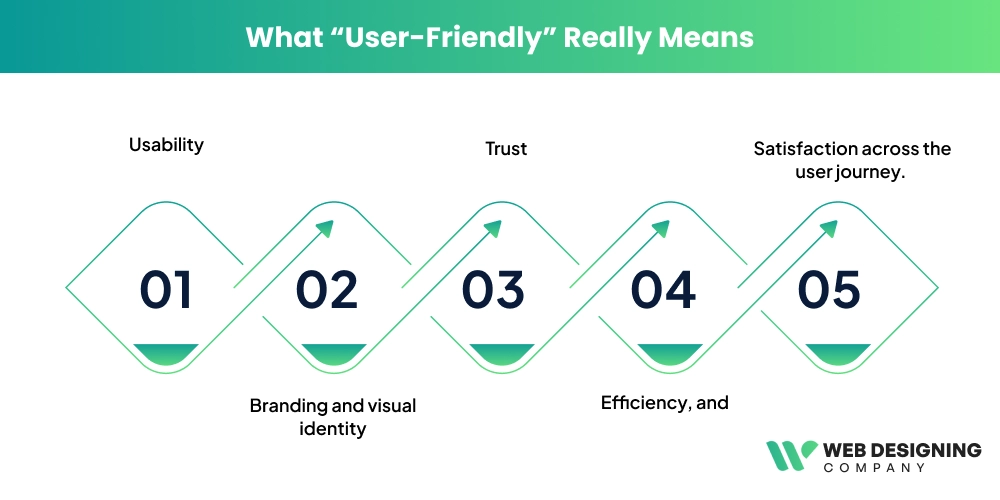
- Usability
- Branding and visual identity
- Trust
- Efficiency, and
- Satisfaction across the user journey.
Essentially, your user-friendly website should be able to answer three major questions:
- What is happening here?
- What will happen if I take action?
- How can I recover if I make a mistake?
A simple example can be seen on Amazon. When a buyer lands on the website:
- They can instantly understand what the site is: an online marketplace for products.
- The product listings (category-wise) and the search bar at the top indicate what action users can perform: search, browse, or buy a product.
- The “Add to Cart” button instantly confirms the buying action by updating the cart icon and showing a confirmation message. This assists the users in understanding what occurred after their action.
- In case the user adds the wrong item by mistake, he/she can delete it immediately and again proceed to the product listing and add the necessary item to the cart. In this way, they understand how to recover from mistakes without being confused.
When users do not get answers to these questions, they will not hesitate to leave your site. That’s what studies reveal:
79% of users leave a website if they don’t easily find the information they are looking for.
Clean design vs clear design is another major shift in the user-friendliness of a website. If your website is visually appealing but offers poor navigation, the design is considered a failure. Research also suggests that over-decorated interfaces tend to slow users and reduce their confidence. On the contrary, sites with a clear hierarchy and predictable interactions give the user confidence and enable them to complete their tasks effectively.
Is Your Website User-Friendly?
Businesses shouldn’t rely on mere assumptions. Instead, you should evaluate your websites based on the quality of user interaction. That means how well users interact with your website and whether they can complete a task effortlessly.
Here are some ways you can check if your website is actually user-friendly:
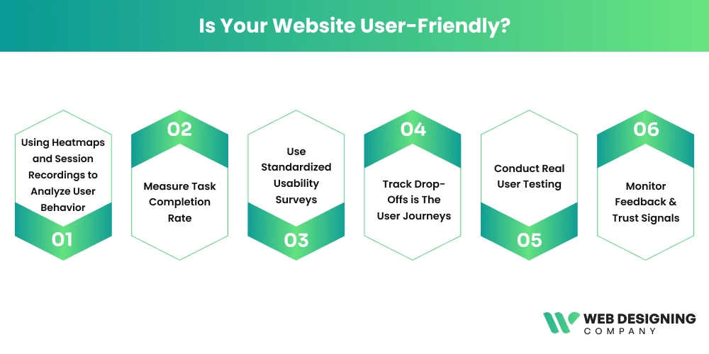
1. Using Heatmaps and Session Recordings to Analyze User Behavior
For example, if users repeatedly click on a non-clickable element (known as rage clicks), a heatmap indicates it as confusion or broken interaction design.
2. Measure Task Completion Rate
The Nielsen Norman Group suggests that the rate of task completion is an important usability test that can be used to quickly and objectively detect design gaps. As an example, when a large percentage of users do not accomplish a task on a site, it indicates the presence of friction in the user experience.
3. Use Standardized Usability Surveys
One commonly used method – System Usability Scale (SUS), is a standardized 10-question questionnaire that creates a baseline across all products. It was designed by usability researcher John Brooke. This method asks users to rate statements about ease of use, complexity, and confidence.
4. Track Drop-Offs is The User Journeys
Understanding where users abandon your site can be a great way to understand UX flaws. Google Analytics and other analytics platforms indicate the point at which the majority of your users drop out of a process. For example, if the majority of users abandon at checkout, the issue could be ambiguous prices or complicated forms.
5. Conduct Real User Testing
Noticing how real users interact with your website is a powerful validation method. In fact, studies show that testing with just five users can reveal around 85% of major usability issues. Users are required to complete an activity in these tests, such as finding a product. The observer notices whether the users hesitate or become confused while performing the task.
6. Monitor Feedback & Trust Signals
Customer tickers, user queries, and feedback forms can uncover what analytics might miss. For instance, if visitors are repeatedly enquiring about how to do something on your site, it is a clear indication that the site is not user-friendly.
Core Elements That Make A Website User-Friendly
Building an easy-to-use website in 2026 is much more than just making things look good. It’s all about natural direction, less friction, & assisting the user in attaining his/her objectives with minimal effort.
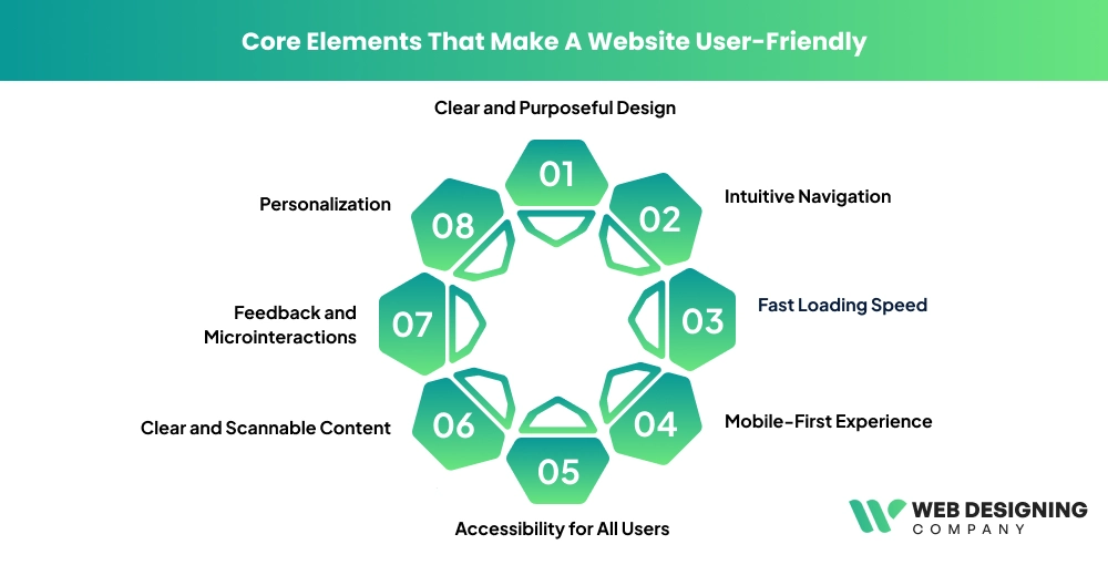
1. Clear and Purposeful Design
The usability is based on a clean interface. Sites in the modern world are purposeful in their simplicity- all things should have a purpose. Large white spaces, legible fonts, and harmonious designs make users scan through the electronic information fast without being overwhelmed.
2. Intuitive Navigation
Your users must never be forced to guess how to use your website. It has clear labels, a sensible menu structure, & visible call-to-action (CTA) buttons that help to facilitate smooth navigation between pages. By 2026, navigation will be even more user-based shortcuts, more intelligent, & having predictive menus.
3. Fast Loading Speed
It is not optional, but mandatory to have speed. Anytime there is a delay of a few seconds, the users will be driven away. Streamlined images, small code, and a fast hosting service make sure that the pages load faster than a light experience to user satisfaction, as well as the performance of the search engine.
4. Mobile-First Experience
Since most people are surfing the internet using their mobile phones, the websites should be programmed according to the smaller screens at first instance. Responsive design also provides layouts, buttons, and content to be platform-friendly (across devices).
5. Accessibility for All Users
Friendly websites are accommodating. Attributes such as navigation, color contrast through the alt text in images, compatibility, & keyboard with a screen reader will make sure that all users can access & engage with your material, even people with disabilities.
6. Clear and Scannable Content
Internet audiences do not actually read; they scan. Use of short paragraphs, bullet points, and strong headings allows the user to locate his or her information fairly fast. Good communication eliminates confusion and keeps users interested.
7. Feedback and Microinteractions
The little things matter. Hover effects, loading indicators, and other minor animations give immediate feedback, letting users know that they are initiating some sort of action.
8. Personalization
Personalization with the use of AI has become a significant part of usability. Websites change content, suggestions, and designs according to how the user is behaving and make them more relevant and interesting.
Psychological Signals That Make Websites Feel Easier to Use
Though there is a similarity in the functionality of the two websites, one of them can be much easier to use than the other. In many cases, such a difference depends on psychology.
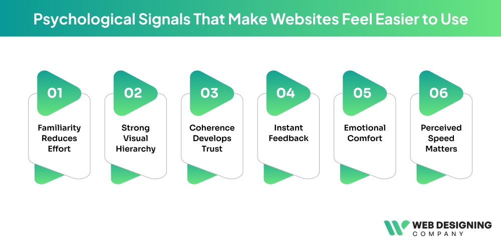
Familiarity Reduces Effort
When users are aware of the patterns, they feel comfortable. Standard layouts, common icons, and expected interactions save on mental effort to navigate a site.
Strong Visual Hierarchy
Attention is directed by design features such as size, color, and spacing. The experience becomes intuitive and smooth when the user immediately knows where to look.
Coherence Develops Trust
The similar design on the pages assists the users in getting accustomed to the interface. Users feel in control when functions, layouts, and interactions all act in the same manner.
Instant Feedback
Users should be assured that they are making progress. Such low-level prompts as button animation, confirmation, or progress indicators decrease uncertainty and enhance usability.
Emotional Comfort
Unobtrusiveness in layouts, easy animations, and amiable microcopy make the experience serene. The design of websites to be stress-free is also starting to be taken seriously in 2026 and is supposed to enable its users to relax when using websites.
Perceived Speed Matters
Although a process can be slow, users can feel that it will be quicker with visual displays such as loading bars or skeleton screens, enhancing their satisfaction.
Collectively, such psychological clues give a site an impression of ease, even when more complex processes might be occurring within the site.
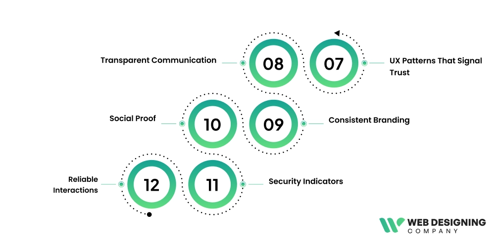
UX Patterns That Signal Trust
One of the major elements of user experience is trust. In its absence, users will not engage, convert, or come back.
Transparent Communication
The pricing is clear, the message is honest, and the policies can be seen, which makes users feel knowledgeable and safe.
Consistent Branding
A well-integrated design system is an indication of professionalism. Once everything appears and acts in a similar manner, the user will think that the site is trustworthy.
Social Proof
Testimonials, reviews, & client logos prove that other people have faith in your brand. This affirmation contributes significantly to making decisions.
Security Indicators
Secure payment badges, authentication cues, and HTTPS are critical, particularly to e-commerce and data-driven websites.
Reliable Interactions
The system has smooth animations, quick reaction speeds, and is free of errors, which provides confidence in the system.
A Case Study
Existing applications such as Canva and Airbnb demonstrate what user-friendly design can be applied to in practice.
Canva: Easy for Everyone
Canva has made design available to millions of people by emphasizing simplicity. Its drag-and-drop feature eradicates complexity & gives even novices the capability to make professional images.
How is Canva easy to use?
- Onboarding of new users.
- Easy-to-use templates
- Clear tool organization
- Live feedback and editing.
The platform eliminates boundaries, and it allows users to make and do without technical expertise.
Airbnb: Clarity and Trust
Airbnb does well in terms of providing an easy process for booking. All processes are user-friendly and understandable, including search to checkout.
Key Strengths of Airbnb
- Enhanced yet easy-to-use search filters.
- Good pictures and comprehensive descriptions.
- Endorsed reviews and ratings.
- Clear pricing and policies.
The success is attributed to both websites being guided by clarity, simplicity, & the needs of the user rather than needless complexity.
AI-Enhanced User Experience in 2026
AI is changing the way users engage with websites & is making them more customized & smarter.
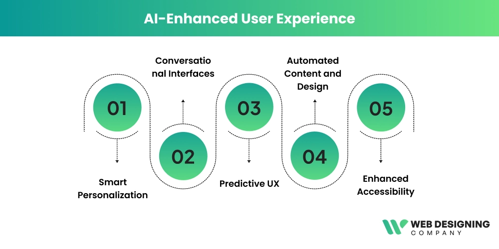
Smart Personalization
Websites have become dynamic & display content & recommendations depending on how users interact with them, what they like, & what they have already seen.
Conversational Interfaces
AI chatbots and voice assistants enable users to communicate in a natural way without using complicated navigation.
Predictive UX
AI is able to foresee the needs of users, proposing both actions and content even before the latter starts searching. This saves on time and effort.
Automated Content and Design
AI applications assist designers in creating layouts, images, and copy in a short time period, making them consistent and efficient.
Enhanced Accessibility
Websites can be more inclusive with the help of AI-enhanced functions such as live captions, voice navigation, & adaptable interfaces.
Websites will not be static objects; they will be intelligent systems, adapting, learning, & advising users in 2026.
Conclusion
The combination of a considered design and psychological knowledge with high-end technology results in a user-friendly site. Intuitive navigation and trust-building features are just the tip of the iceberg that will help users feel more at ease using the application because of the AI-based personalization made available in each detail.
In case you wish to have a site that not only is attractive but also performs in an outstanding manner, hiring professionals is the wisest step. Web Designing Company is the place to create a website that would bring real results and make the users continue to visit it.